Follow Me On Social Media!
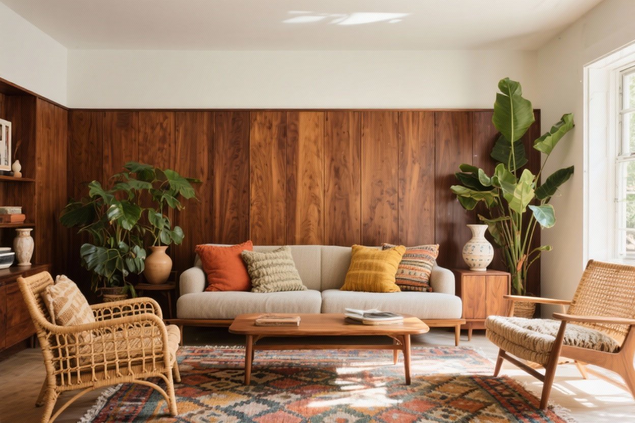
Timeless Colors for a Modernized 70s Home: Boho and Walnut Accents That Wow
You can totally bring the best of the 70s into your home without making it look like a time capsule. Think: rich walnut wood, layered boho textures, and a palette that feels earthy, chic, and forever stylish. If you love cozy vibes, warm colors, and a little drama (who doesn’t?), you’re in the right place.
Let’s walk through seven color-forward ideas that nail the 70s spirit—minus the shag overload. We’ll keep it modern, approachable, and absolutely gorgeous.
1. Start With A Grounding Base: Walnut, Cream, And Soft Taupe
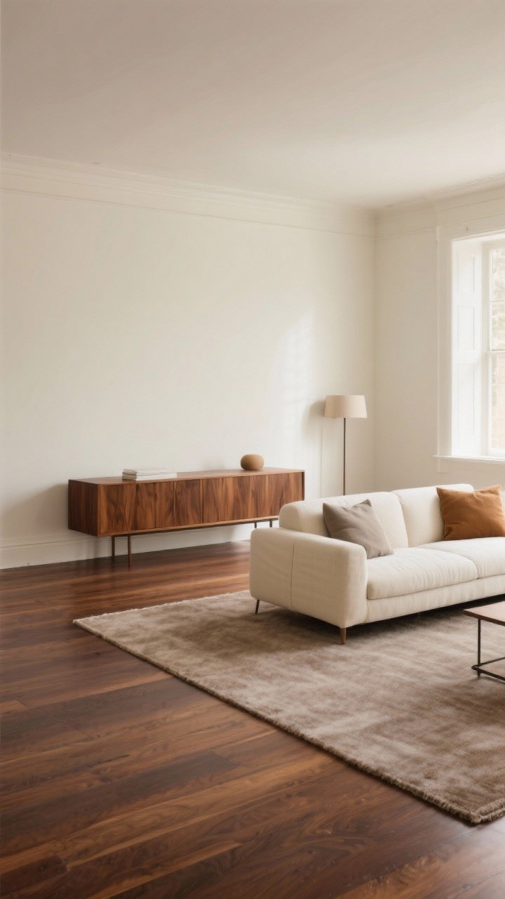
Every great 70s-inspired space needs a calm foundation, and walnut is the star. Its deep brown grain instantly warms a room and pairs beautifully with creamy walls and soft taupes. It’s nostalgic but still super modern.
Pick Your Neutrals Wisely
- Walls: Warm off-whites (think alabaster, ecru, or light mushroom) keep things bright without feeling stark.
- Floors: Walnut or medium oak. A matte finish keeps it current.
- Big upholstery: Go cream, camel, or greige so your color accents can do the talking.
FYI: A creamy backdrop makes vintage finds look intentional instead of random. It’s the interior equivalent of good lighting.
2. Bring Back Earthy 70s Hues (But Make Them Modern)
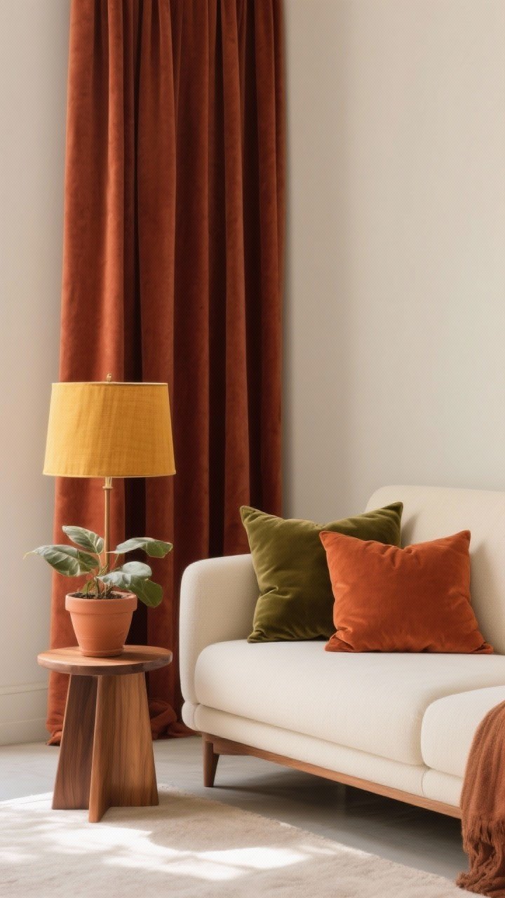
The 70s had a color crush on nature—hello ochre, terracotta, avocado, rust. Today, we use those shades in softer, more curated ways. Think muted, not neon. Saturated, not loud.
Modernized Palette Ideas
- Terracotta + Walnut: Use terracotta in pillows, planters, and artwork. It warms wood beautifully.
- Olive + Cream: Olive velvet or linen elevates everything—sofa cushions or a statement chair, IMO.
- Mustard/Ochre: A throw, a lampshade, or kitchen stools—small hits go a long way.
- Rust + Clay: Great for rugs and drapery. Adds depth without shouting.
Pro tip: Keep your earthy hues matte or textured so they look luxe, not costume-y.
3. Layer Boho Textures For Instant Soul
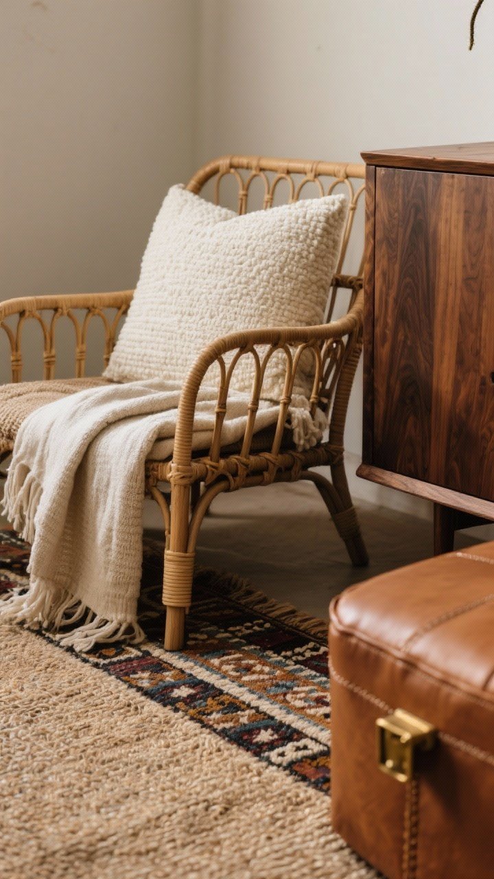
Color gets all the attention, but texture does the heavy lifting. The right mix makes your palette feel collected and cozy—more boutique hotel, less thrift-store chaos.
Texture Combos That Always Work
- Rattan + Walnut: A rattan chair next to a walnut credenza? Chef’s kiss. Light against dark = balance.
- Bouclé + Linen: Cream bouclé on a pouf or pillow adds plushness; linen keeps it airy.
- Wool Rugs + Jute Layers: Start with a jute base, top with a patterned wool or kilim for boho cred.
- Leather: Caramel or cognac leather ties in walnut and warms earthy colors effortlessly.
Keep metals minimal and warm—brushed brass or aged bronze plays beautifully with boho vibes.
4. Curate Patterns: Retro, But Subtle
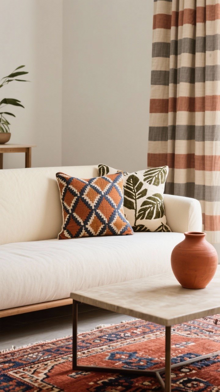
We love a retro pattern, but we’re not recreating a 1974 basement. The trick is mixing one bold motif with a couple of quieter companions. Repeat colors, not patterns, to keep cohesion.
Pattern Pairing Menu
- Geometric + Organic: A bold geometric pillow with a leafy block print. The contrast feels fresh.
- Stripes + Kilim: Narrow stripes on drapes + kilim rug in rust and indigo = layered perfection.
- Tone-on-Tone: Terracotta-on-terracotta in slightly different textures reads luxe, not busy.
Limit yourself to three patterns per room. If you’re a maximalist, make one pattern oversized and keep the rest small-scale. Balance is the secret sauce.
5. Use Walnut As Your Anchor In Every Room
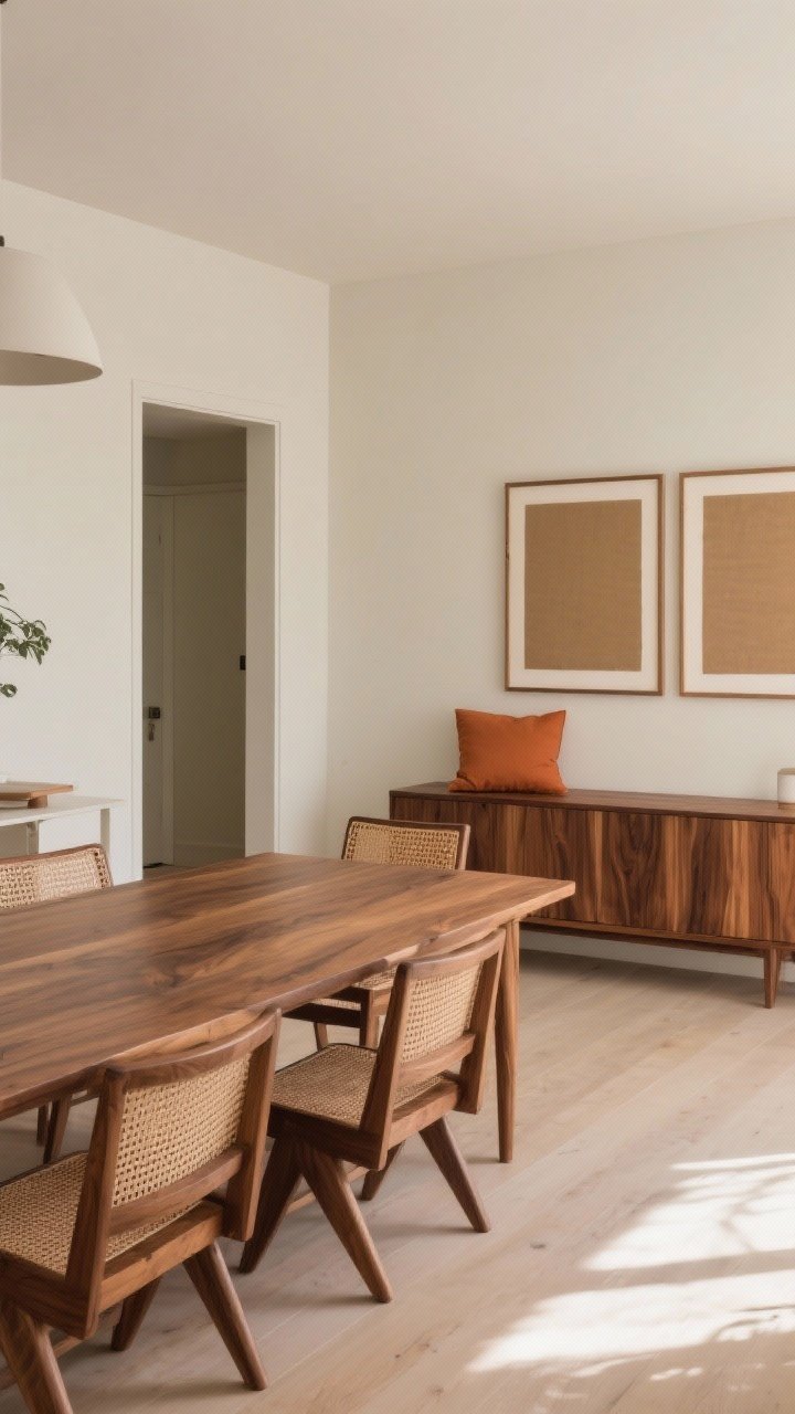
Walnut is your North Star. It adds warmth, takes color beautifully, and grounds boho energy so it feels elegant instead of chaotic. Sprinkle it in different forms for a collected look.
Walnut Touchpoints
- Living Room: Media console, coffee table, or framed art with wide walnut mats.
- Dining: Walnut table + woven cane chairs—70s nod, fully updated.
- Bedroom: Walnut nightstands, a slatted headboard, or sculptural lamps.
- Entry: Slim walnut bench with a terracotta cushion. Instant welcome moment.
Keep wood tones related, not identical. A little variation feels natural and adds depth.
6. Accents That Sing: Plants, Ceramics, And Moody Lighting
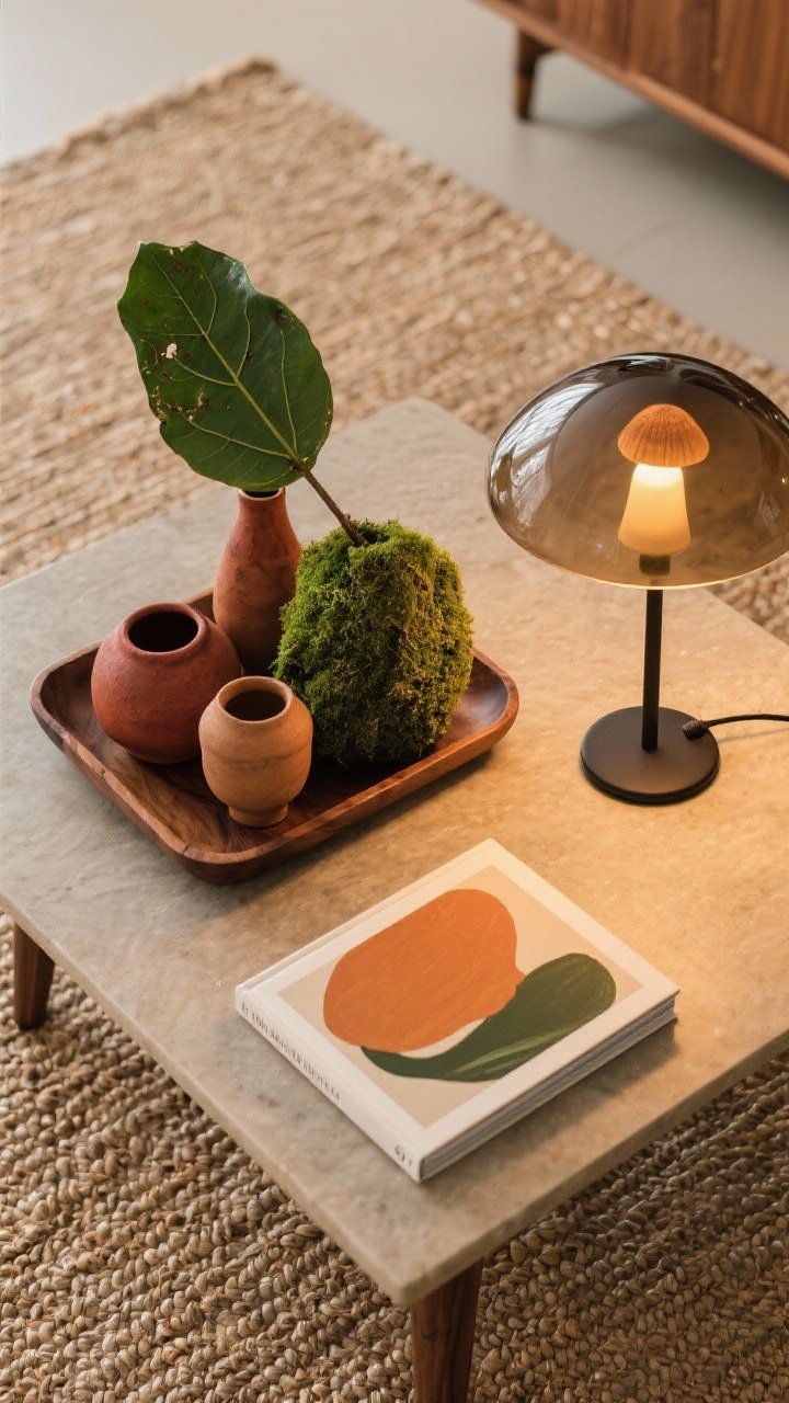
Accessories are where your palette comes alive. A few well-placed accents can pull the whole 70s-meets-now story together. Yes, your monstera counts as decor—water it, though.
Accent All-Stars
- Plants: Rubber trees, philodendron, and snake plants bring that lush 70s energy.
- Ceramics: Handmade vases in rust, clay, or mossy green add soul and texture.
- Lighting: Go warm and glowy—linen drum shades, smoked glass pendants, or a mushroom lamp for a playful nod.
- Art: Abstracts in ochre and olive, or vintage landscape prints with walnut frames.
IMO, dimmers are magic. Warm bulbs (2700K–3000K) make every color look richer and more flattering. You’ll even like your wall at night.
Try A Micro Palette Per Zone
- Sofa corner: Cream + Olive + Walnut
- Dining: Terracotta + Brass + Walnut
- Bed: Taupe + Rust + Linen
Repeating two colors across zones keeps your home cohesive while still letting each area have a moment.
7. Small Swaps, Big Impact: Paint, Hardware, And Fabrics
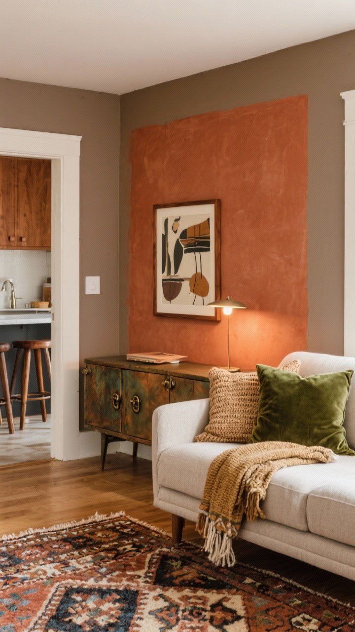
No renovation? No problem. You can modernize a 70s vibe with a weekend and a paint roller. It’s all about high-impact color choices and tactile upgrades.
Weekend Update Checklist
- Paint One Accent: A terracotta half-wall behind the sofa or rust in the dining nook adds instant warmth.
- Switch Hardware: Swap nickel for aged bronze or brushed brass to echo walnut’s warmth.
- Textile Refresh: Add an olive velvet pillow, a woven throw, and a patterned kilim to layer color and texture.
- Frame It Right: Reframe art in walnut or dark wood to tie rooms together.
- Rug Strategy: If your sofa is neutral, choose a rug with rust, olive, and cream to anchor the palette.
Bonus: If your kitchen has white cabinets, try warm taupe walls and walnut stools. It’s subtle, chic, and very “I actually planned this.”
Ready to channel your inner 70s design icon—with taste? Blend earthy hues, lean into walnut, and layer boho textures like a pro. Keep your palette warm and your patterns intentional, and your home will feel timeless, inviting, and effortlessly cool. Now cue the vinyl and pour something in a ceramic mug—you’ve got the look down.
